
In the second part of this series we looked at the CSS3 transition-timing-function property which controls how an animation varies in speed throughout the duration of the transition. This accepts keyword values such as ease, ease-in and linear which are normally enough for the most demanding CSS developer.
However, you can define your own timing functions using a cubic-bezier value. It sounds and looks complicated but can be explained with some simple diagrams.
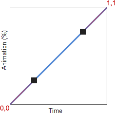
The diagram above plots the percentage of the animation complete against time. The line is linear so, in effect, the proportion of the animation completed matches the time, e.g. 50% of the animation is complete half-way through the duration.
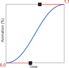
This diagram shows the ease-in-out curve:
- It starts slowly; approximately 12% of the animation is completed in the first 25% of time.
- It ends slowly; the last 12% of the animation occurs in the last 25% of time.
- Therefore, the middle 76% of the animation must occur during 50% of the time; it’ll be faster.
In essence, the steeper the curve tangent, the faster the animation will occur at that time. If the line was vertical, the animation would be instantaneous at that point. This is demonstrated in the following diagram:

Half-way through the duration, the animation will jump from approximately 30% complete to 70% complete.
We can imagine that all transition animations start at point 0,0; the animation is 0% complete (in its start state) after zero time. Similarly, they will end at point 1,1; the animation is 100% complete (in its end state) at the end of the duration.
Therefore, we can define a bézier curve between 0,0 and 1,1.
What’s a Bézier Curve?
 You’ll have seen bézier curves used in graphics packages. Given the start point (P0) and end point (P3) of a line, a bézier curve defines two control points for each end (P1 and P2). I won’t even begin to explain the mathematics but, if you’re interested, head over to Wikipedia or WolframMathWorld for the stomach-turning equations.
Luckily, we don’t need to worry about the complexities. Since our animation line starts at 0,0 and ends at 1,1, we just need to define points P1 and P2 in the cubic-bezier value, e.g.
/* cubic-bezier(p1x, p1y, p2x, p2y) */

/* identical to linear */
transition-timing-function: cubic-bezier(0.25,0.25,0.75,0.75);

/* identical to ease-in-out */
transition-timing-function: cubic-bezier(0.420, 0.000, 0.580, 1.000);
Note that the the x co-ordinates of P1 and P2 denote time and must be between 0 and 1 (inclusive). You couldn’t set a negative value since it would start earlier than it was triggered! Similarly, you couldn’t set a value greater than one since time cannot proceed to, say, 120% then reverse back to 100% (unless you have a TARDIS or flux capacitor to hand).
However, the y co-ordinates denote the animation completed and can be any value less than zero or greater than one, e.g.
transition-timing-function: cubic-bezier(0.5, -0.5, 0.5, 1.5);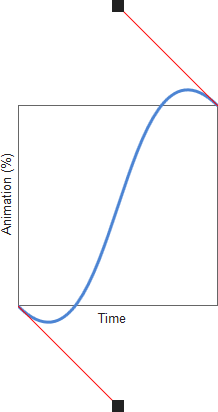
At approximately 15% of the duration, the animation is -10% complete! Therefore, if we were moving an element from 0px to 100px, it would be at -10px at that time. In other words, we have a bounce effect; head over to cubic-bezier.com and click GO to see it in action.
Let the Tools do the Work
Defining bézier curves can involve trail and error to achieve the effect you want. Fortunately, there are a number of great tools to help you experiment and produce the correct code:
In the final part of this series, we’ll look at a couple of advanced transition techniques.